
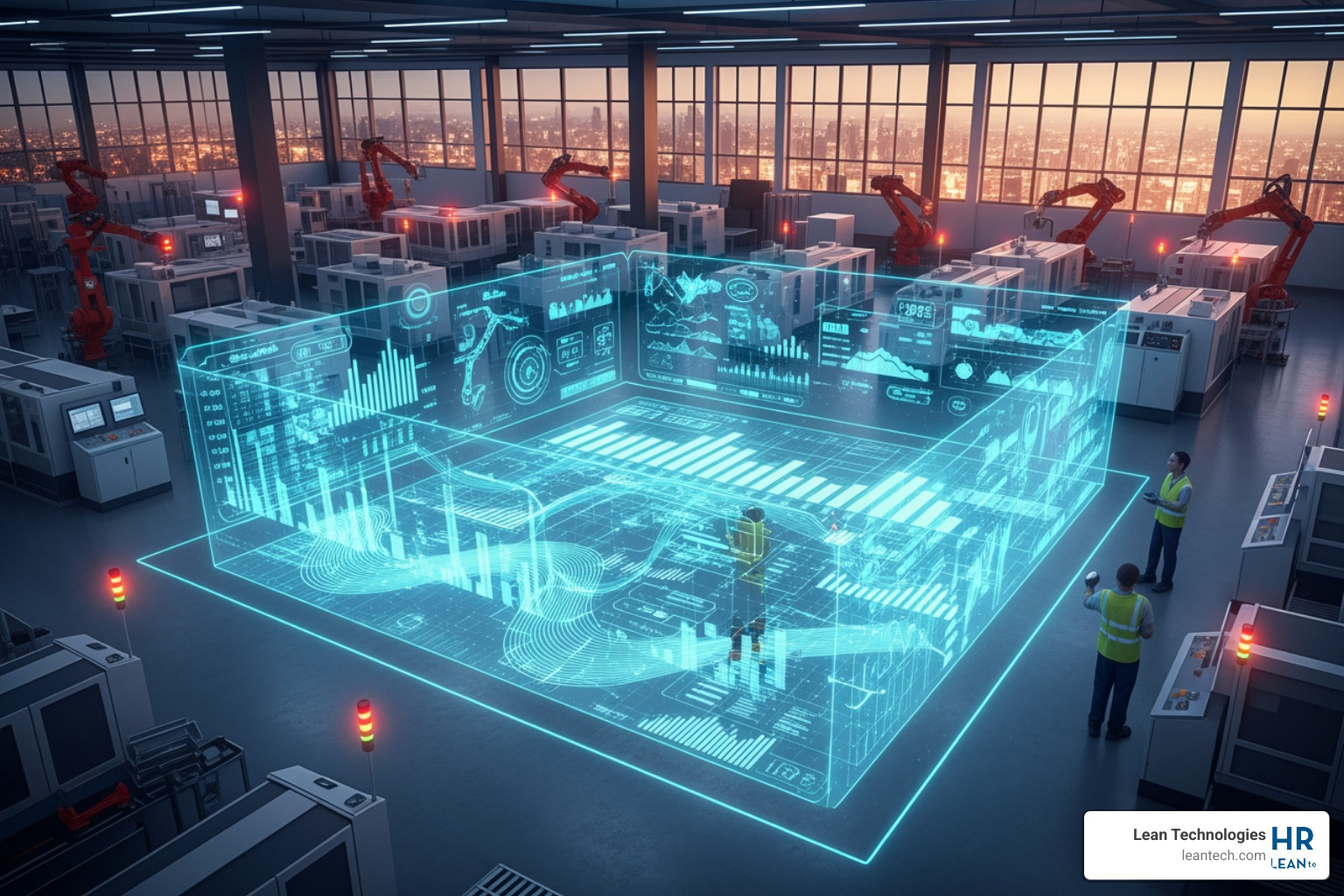
Dashboard Dreams: Visualizing Your Way to Manufacturing Excellence
From Raw Data to Real-Time Action
Manufacturing data visualization turns raw production numbers, machine logs, and shop floor activity into clear, visual formats.
Think dashboards, charts, and graphs.
Your team can see what is happening right now and take action immediately.
Quick Answer: What You Need to Know
What it is: Graphical displays of production data (OEE, downtime, quality rates) using charts, gauges, and real-time dashboards.
Why it matters: Helps you spot problems faster, make better decisions, and boost productivity by up to 20 percent.
Key benefit: Transforms complex spreadsheets into simple visuals anyone on the floor can understand at a glance.
Best use: Real-time monitoring of production lines, quality control, and machine utilization.
Data on a spreadsheet is a history lesson.
A dashboard is a conversation.
The goal is to turn raw numbers into insights your team can act on now.
Not at the end of the shift.
Research shows that better analytics help you spot problems you did not even know you had.
Hidden bottlenecks, quality slips, or machines sitting idle while your team scrambles.
But this is not about generating more reports for managers to review in Monday meetings.
It is about giving operators the info they need to win their shift.
When your team can see the score in real time, with production counts, downtime events, and defect rates, they do not have to guess.
They do not have to wait.
They can fix problems as they happen, not hours later when the damage is done.
That is the power of manufacturing data visualization.
It replaces gut feelings with hard facts and transforms your shop floor from reactive to proactive.
What is Manufacturing Data Visualization?
Simply put, manufacturing data visualization is taking all the numbers, logs, and measurements from your production floor and turning them into easy-to-understand pictures.
Think charts, graphs, and dashboards.
It is about making complex data simple.
Instead of sifting through endless rows in a spreadsheet, you get a clear, visual story of what is happening.
This graphical representation cuts through the noise.
It helps you see trends, spot anomalies, and understand performance at a glance.
It is the fastest way to turn raw numbers into actionable intelligence for everyone, from the operator on the line to the plant manager.
It is a core component of digital lean manufacturing, giving teams the insights they need to continuously improve.
Why Is It So Important?
Why bother?
Because speed and clarity win.
When you can see your data clearly, you make faster decisions.
Visuals help you spot errors or inconsistencies that might hide in raw data, leading to increased accuracy.
When bottlenecks or inefficiencies are highlighted visually, they become obvious targets for improvement, driving process efficiency.
This helps you find hidden bottlenecks you did not even know existed.
It fosters a data-driven culture where everyone speaks the same language, based on facts, not assumptions.
This is not just about making things look pretty.
It is about building a foundation for continuous improvement and sustained profitability.
Want to dive deeper into how data powers your operations?
Check out our insights on how to Thrive on big data for small manufacturers.
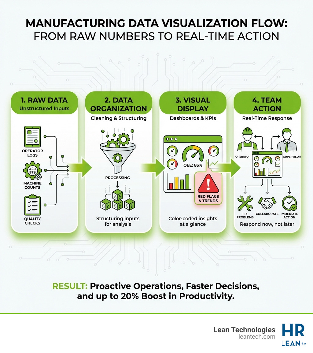
Changing Raw Data into Actionable Insights
How do we get from a pile of numbers to something truly useful?
It is a clear process.
First, data collection.
This is where the rubber meets the road.
Data comes from your operators logging issues, supervisors entering shift data, or imported files from machines and ERPs.
We organize and drive action from this data.
Next, data cleaning.
Raw data can be messy, so we need to ensure it is accurate and consistent.
Then, data organization.
We structure the data so it makes sense, allowing us to start identifying patterns and highlighting trends.
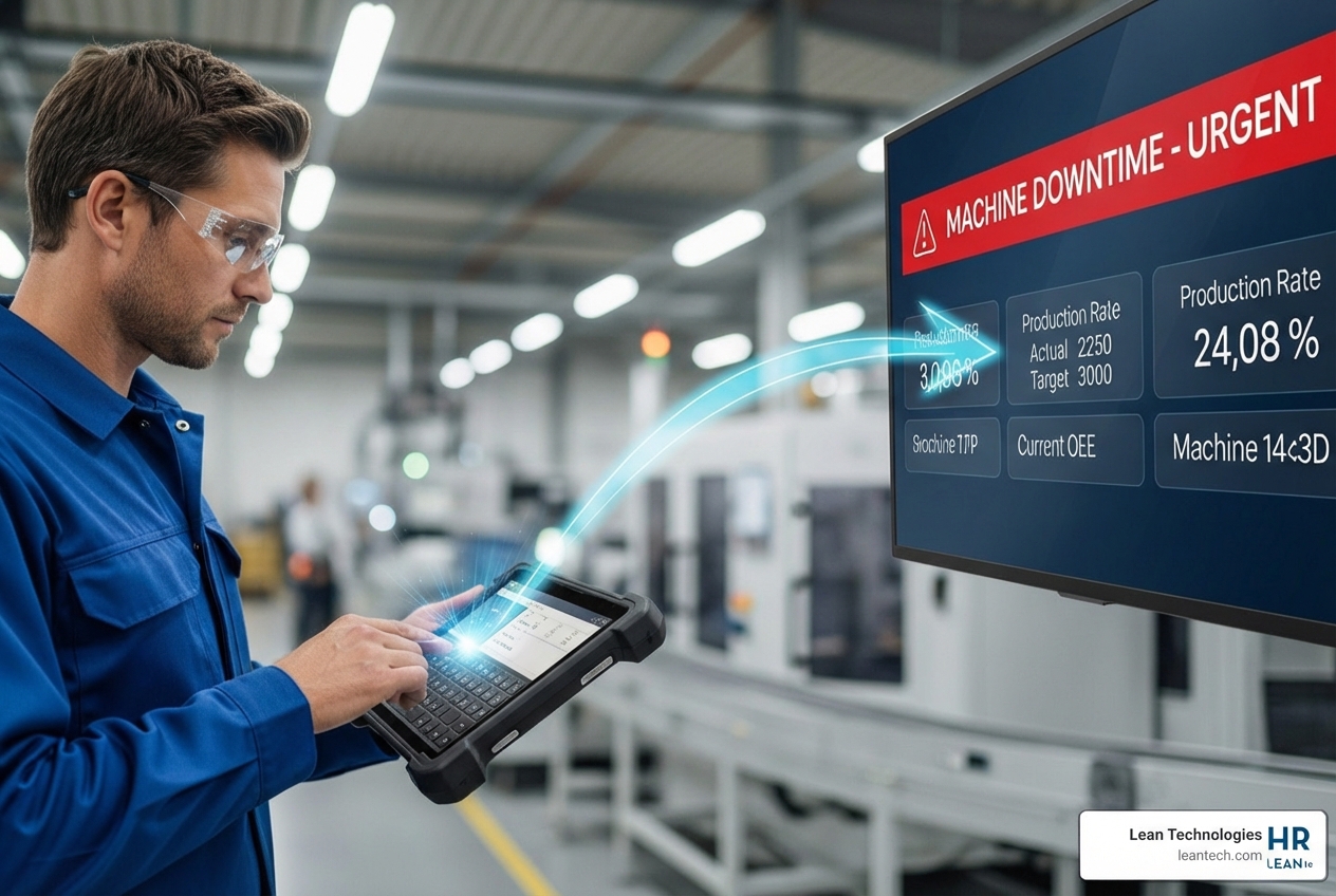
For example, an operator logs a machine downtime event.
This raw input is instantly transformed from a written note to a red alert on a dashboard.
Now, everyone can see that the machine is down.
That is real-time visibility.
The Shop Floor Scoreboard: Types of Visualizations
Not all visuals are created equal.
You need the right tool for the right job.
The key is to present info so clearly anyone on the floor can see the score at a glance.
Think of it as a scoreboard for your production line.
Are we winning or losing?
What do we need to do next?
Real-Time Manufacturing Dashboards
This is your mission control.
Real-time manufacturing dashboards display current Key Performance Indicators such as Overall Equipment Effectiveness, production counts, downtime tracking, and quality rates.
They provide a live snapshot of what is happening right now.
Data flows from operator input on tablets, manual logs, or imported feeds from existing systems.
It is immediate.
It is actionable.
Imagine a large screen on the shop floor showing a machine in green because it is running well, or red because it is down.
That is an Andon board in action.
It provides real-time monitoring that empowers your team to react instantly.
Dynamic Production Reports
While dashboards are about now, dynamic production reports are about then and why.
They offer historical analysis, allowing you to spot trends over time.
You can easily compare shift performance, identifying best practices or areas needing improvement.
These reports are crucial for root cause analysis, helping you dig deeper into why problems occurred.
They provide the strategic foundation for continuous improvement.
Here is a quick comparison:
Feature Real-Time Dashboards Dynamic Production Reports Purpose Immediate action Strategic improvement Timeframe Current moment Historical periods Key Users Operators, Supervisors Managers, Engineers, CI Teams Data Source Live input, imported data Aggregated historical data Interactivity High (alerts, drill-downs) Moderate (filters, comparisons)
The Power of Effective Manufacturing Data Visualization
Effective manufacturing data visualization hinges on a few core principles.
Clarity means anyone can understand it in seconds.
Context means the data is meaningful, with targets and benchmarks that show if a result is good or bad.
Accuracy means the data is reliable, because visualizations are only as good as the data feeding them.
Interactivity means users can dig deeper to explore the data without needing technical expertise.
Role-based views matter, because not everyone needs to see everything.
Operator dashboards focus on their machine status, while supervisor views show team performance.
This custom approach ensures information is relevant and actionable for each team member.
It is about giving the right information to the right person at the right time.
For more on structuring your operations, explore our guide on project management at https://leantech.com/project-management.
The Big Wins: How Visualization Drives Performance
This is not just about pretty charts.
It is about real results that hit the bottom line.
When you track performance in real time, productivity can climb by as much as 20 percent.
Why?
Because problems have nowhere to hide.
Small stops, quality slips, and slow cycles become instantly visible, and your team can address them immediately.
Improve Machine Utilization and Reduce Overtime
Idle machines hurt profit.
Manufacturing data visualization helps you track uptime versus downtime with precision.
You can identify idle time and its root causes, whether it is waiting for materials, maintenance, or operator intervention.
By optimizing changeovers and reducing unplanned stops, you get more out of your existing equipment.
This directly translates to less pressure for overtime and supports better work and life balance for your team.
When machines are running efficiently, your people can focus on value-added tasks instead of chasing production.
This helps you build smarter maintenance strategies based on facts, not guesses.
You can learn more about this at https://leantech.com/maintenance.
Reduce Downtime and React Faster
Downtime reduces productivity.
With manufacturing data visualization, you can monitor machine status in real time through operator logs or imported data.
This allows you to spot trends in downtime.
You can see whether certain machines are failing more often, or if a specific shift is experiencing more issues.
This proactive insight helps you prevent repeat problems by addressing the root cause.
You might use a line graph showing downtime events.
If the line starts trending upwards, it functions as a clear warning.
You can intervene before a small problem becomes a large failure.
Boost Quality Control and Reduce Waste
Quality is the responsibility of everyone on the floor.
Manufacturing data visualization helps you track defect rates in real time.
If one process has a higher scrap rate while others are much lower, it is flagged for immediate attention.
You can use Pareto charts for defects to quickly highlight that a large share of defects comes from a small number of main causes.
This directs your efforts where they will have the biggest impact.
This approach allows you to identify high-scrap processes and focus your improvement efforts.
The result is a reduction in rework and overall waste.
You can see more about how we approach quality at https://leantech.com/thrive-quality.
Beyond the Numbers: Boosting Morale and Transparency
Your team wants to win.
But they cannot win if they do not know the score.
Manufacturing data visualization creates transparency.
It shows everyone how their work contributes to the bigger picture.
This is not about big brother.
It is about objective truth.
When a machine is the bottleneck, the data proves it, taking the pressure off your operators.
With 77 percent of manufacturers struggling to retain employees, creating a transparent, empowering workplace is important.
You can see more detail on this topic at https://insightglobal.com/blog/recruiting-manufacturing-jobs-challenges/.
Improve Employee Morale and Engagement
When employees see their impact, morale improves.
Clear goals displayed visually give everyone a target to aim for.
Visible progress against those goals supports a sense of purpose.
It supports team accountability because everyone sees how their actions affect performance.
When targets are hit, you can recognize those wins together and support positive behaviors.
This approach also helps separate employee performance from machine downtime, leading to fairer assessments.
For more insights into managing your teams, explore our HR solutions at https://leantech.com/thrive-hr.
Create a Culture of Transparency
Transparency supports trust.
When shared goals are visible on dashboards, everyone understands what you are working toward.
Objective performance data removes some subjectivity from discussions.
It supports fact-based conversations rather than finger-pointing.
This is about building trust across shifts and departments.
When everyone has access to clear information, they can work together more effectively.
Guidance on measuring performance is discussed in sources such as https://hbr.org/1988/01/no-nonsense-guide-to-measuring-productivity.
The focus is on making sure everyone knows the score, not just the leadership team.
Getting Started: A No-BS Guide to Implementation
Ready to start?
Do not try to do everything at once.
Start with one problem.
What is the most painful, paper-driven process you have?
Start there.
The foundation is simple: structured, real-time data, entered at the source.
Best Practices for Your Manufacturing Data Visualization
To make your manufacturing data visualization effective, follow these best practices:
Establish clear KPIs: Focus on a few metrics that drive action, not vanity metrics.
Choose the right tools (like Thrive): You need a flexible digital toolbox that lets operators log issues and track actions. It should organize your data, not replace your ERP or MES.
Train your team: Data is only powerful if people know how to use it. Engage your plant personnel.
Start small and iterate: Pick one critical process, get it working well, then expand.
Ensure data quality: Poor inputs lead to poor outputs. Make sure the data you are visualizing is accurate.
This approach can also support safety protocols by making incidents and near-misses visible quickly.
You can learn more at https://leantech.com/safety.
Common Challenges to Sidestep
Implementing manufacturing data visualization is not always easy.
Here are the biggest pitfalls we see:
Information overload: Too many charts and no clear focus can confuse people. Keep dashboards focused on KPIs that drive action.
Poor data quality: If your data is incomplete or missing, your visualizations will be misleading. Work to ensure data is clean and entered correctly.
Lack of team buy-in: If your team does not see the value, they will not use the tools. Involve them early in the process.
Other challenges include integrating legacy systems and spending too much time analyzing instead of acting.
Do not get stuck in endless analysis without taking action.
Real-time is more effective than information that is delayed.
If data is captured on paper and entered at the end of the shift, it is already late.
Frequently Asked Questions about Manufacturing Data Visualization
How do you visualize manufacturing data?
We visualize manufacturing data by using tools like dashboards and reports to turn raw numbers into charts, graphs, and gauges.
One effective way is to display real-time Key Performance Indicators such as Overall Equipment Effectiveness, downtime, and production counts on screens that the shop floor team can see.
This data comes from operators or is imported from your existing systems.
What is a manufacturing dashboard?
A manufacturing dashboard is a real-time, visual interface that displays the current status of your production floor.
It consolidates data from sources such as operator input, shift logs, and imported machine data into a single, easy-to-understand view.
This helps teams make fast, informed decisions by making key measures easy to read and understand.
How does data visualization improve decision-making?
Data visualization improves decision-making by simplifying complex information.
Instead of examining large spreadsheets, a manager or operator can see a trend or spot an anomaly in seconds.
This speed allows teams to address problems as they happen, not hours or days later.
In Summary: Stop Guessing, Start Seeing
Manufacturing data visualization is not an IT project.
It is an operational tool.
It replaces gut feelings with facts.
It transforms your shop floor from reactive to proactive.
By giving your team a clear, real-time view of performance, you empower them to solve problems faster.
They can improve processes and stay on top of each shift.
Stop managing your shop floor through spreadsheets and guesswork.
Let your team run lean, with real-time visibility and fewer workarounds.
Thrive by Lean Technologies provides flexible digital tools to support this work.
See how to build a culture of continuous improvement today.
With the right approach to manufacturing data visualization, you can connect data, teams, and decisions in one simple flow.